Scandinavian Airlines
Design CaseOnline and offline strategy of improving user experience and redesigning the booking flow for web and mobile
- 10 weeks
- In team with: Diego Dalia, Fereshteh Khodabakhshi, Den Tserkovnyi
- My contribution: Expert review, paper prototyping for both mobile and web, mobile app digital prototyping, making presentational video, narration
The main challenge for us is to provide continuous experience while booking a ticket, considering the users’ needs and goals, as well as advance up selling and other services that correspond to business goals of Scandinavian Airlines and reflects their brand values.
Results
The interfaces we created were presented in a video with explanation of design decision made through the process.
I was mostly involved in prototyping the mobile application for iOS7, so the details of a mobile prototype are showcased here. Before starting conceptualising ideas on the paper the Apple Human Interface Guidelines were carefully read.
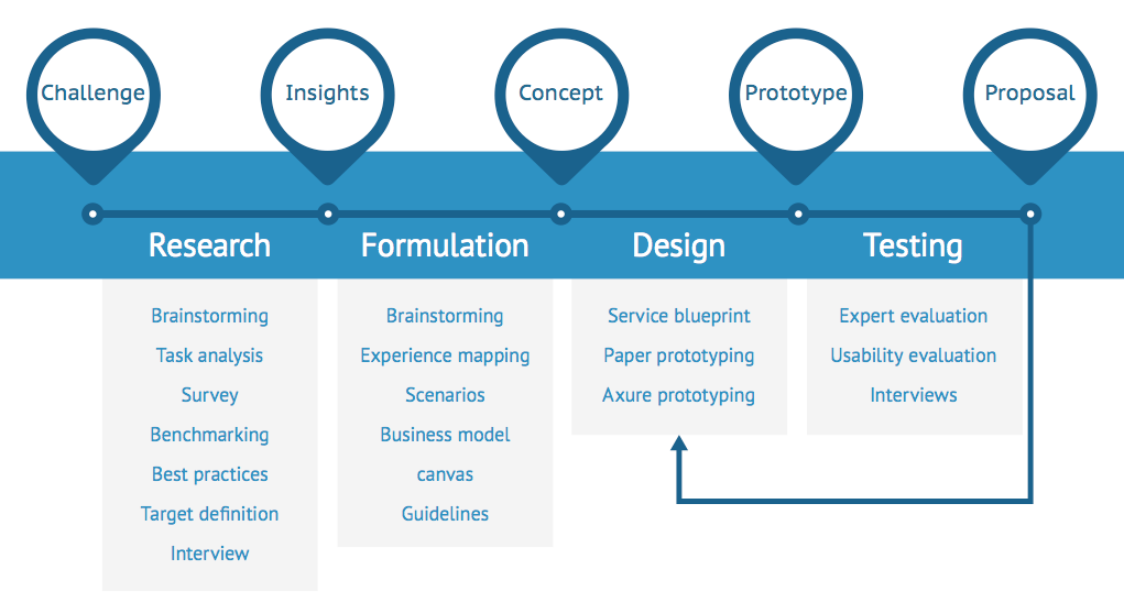
Process
The current work shows the way to create a consistent cross-platform booking flow for the web and
iOS 7. The first step was to analyse the business requirements and limitations, to do benchmarking
to understand what was on the market, and to perform interviews to get the insights about users’
needs. Then the ideas were transformed into concepts, prototyped and tested with users.
Problem
One of the main problem we had to solve can be formulated as follows:
The existing booking flow could be reached from at least fourteen different entry points
and the interface itself may vary depending on the type of customer and entry point. Moreover, the mobile interface has a different look and feel from the one on the web, which altogether creates broken experience and needs to be fixed.
User research
The previous research showed three main groups of users: leisure traveller who are loyal to the company, business traveller and commuters, and newcomers who are looking for the cheapest options.
Due to time constraints and a very limited availability of users from Scandinavia in the Netherlands, we performed interviews in place to figure out the most important aspects of airline experience, talked to business travelers on the phone and launch an online survey.
We found out that
- 89% of them use the desktop to book tickets (it is more comfortable and safe);
- about 30% use the mobile device;
- 80% of purchases are made on the airline’s website;
- additional services (hotels, cars, etc.) are bought through external specialized websites;
- services at the right time might enhance the chance of upselling.
Concept
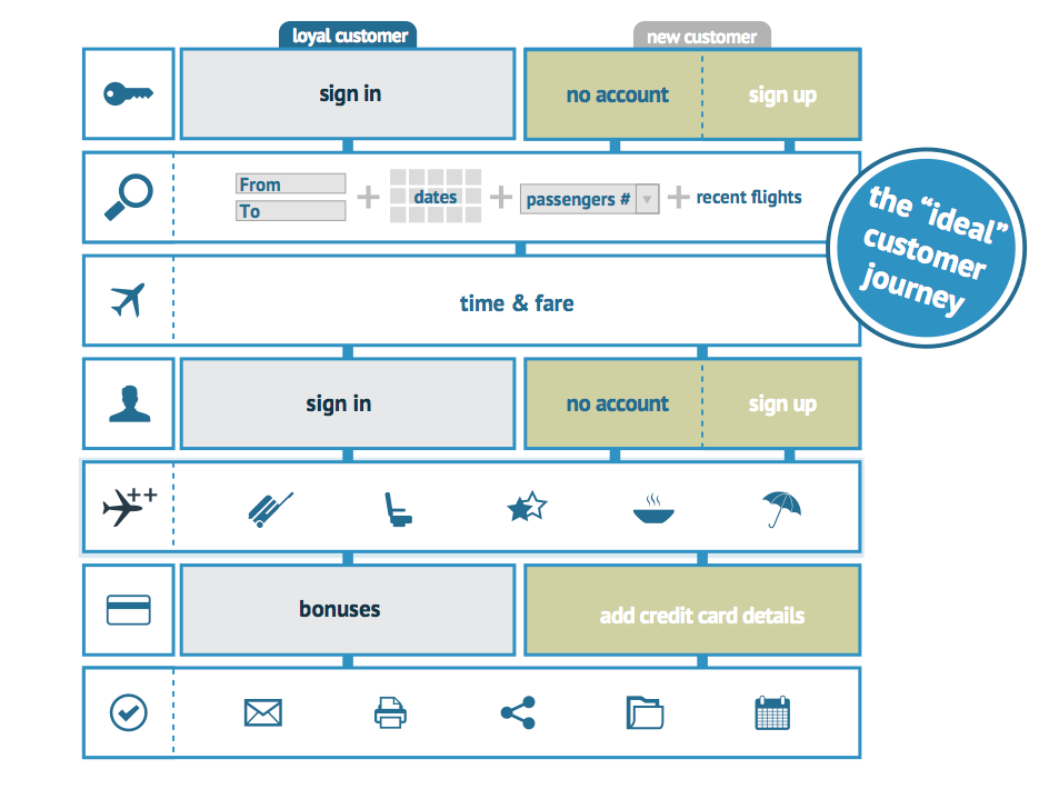
The findings resulted in a customer journey for both web and mobile platforms.
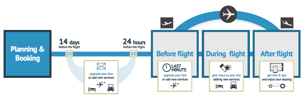
As a part of this model, the booking process was further divided into seven major steps and became
the core for the final interface.
Prototyping
The ideas were first prototyped on paper and then transferred to Axure. Since Axure exports prototypes as HTML files with CSS and Javascript, it was quite obvious how to make it look like a website. Unlike that, the mobile prototype required some settings to make it look like a native iOS7 application.
User Testing
Every design decision made during the process was backed up by either user and business requirements, or platform guidelines, or best practices. Both web and mobile interfaces were tested with real users who were provided a scenario to perform.
The second iteration to improve the interface according to main user test findings has been done as well, and a list of further recommendations was created to implement in the future.