Dott
E-bikes and e-scooters sharing serviceLed design system efforts for operations tooling, and improved UX on rider and operations side
- 2.5 years
- Main contribution: Led design system (DS) for operations, updated Rider app UI library (planned the future DS), worked on payments and parking, optimized operations workflows in internal tools
- ridedott.com
Dott (since March 2024: Tier-Dott) is a micromobility operator with a mission to change micromobility for good. It operates across Europe and Middle East, but not in the Netherlands.
As a Product Designer, I had to consider the needs of riders, internal users and business, and the city requirements.
I took an initiative to lead the design system effort to speed up design and development on both Rider app and internal tools.
I joined Dott to work on the payments UX but in the over the time I also:
- 🖥️Set up and led the design system for operations tools, updated UI components for Rider app and proposed a DS plan for it
- 🦄Ran a design charter to get to know the team and our values,
- 🅿️Did a number of discovery projects to help users with parking
- 👷Designed new features to improve efficiency of operations, such as zones upload that saves up to 40 hours for the local ops.
+ Lots of other UX improvements, like Delete account flow, promoting passes and adding the legend to the map
Additional details of my work at Dott can be presented upon request in person.
Design system and accessibility
Dott has two separate systems for Rider (customer facing) and Operations (internal). I worked on both the Rider app, a product with mobile-only components, and the operations tools: a web app for the “office” staff and mobile for ground teams
Operations Design system
Operations had a web app to manage fleet, riders, shifts and city settings, and a mobile app for everyday tasks for the drivers
I was leading the design system effort for the web app and worked with the devs on implementation.
- Problem
Operations web tool (Portal) had a lot of legacy design and code. Engineers had to no components to reuse and design had lots of inconsitencies. - Outcome
I audited the whole Portal to list components, ran a workshop with the dev to set up priorities, identified key components and set up the JIRA epic for dev work.
The key challenge was to get engineering on board. Luckily, the engineering manager was keen on having a design system and the devs were quick, supportive and creative with implementation. A true team work made the best results 🚀
Another challenge was to keep the birds eye view on the whole system AND keep everything consistent. Sometimes I had to manually recreate parts of product (e.g. all the side panels) to see how the components work there.
At the moment all components are designed and the development is WIP
Here's the overview of the process
-
Set up the token library.
- Added color tokens and created light and dark theme in Figma (mostly for the Rider app) to convert the designs to dark mode in 2 clicks instead of recreating all assets.
- Added spacing and typography tokens using Figma variables.
- Collaborated with the devs to get it implemented.
- Added color tokens and created light and dark theme in Figma (mostly for the Rider app) to convert the designs to dark mode in 2 clicks instead of recreating all assets.
- Made a list of all necessary components and added them to Figma.
- Strategically decided to focus on most impactful ones first: forms and tables.
- For each component I added a changelog, component section, guidelines and specs, and examples of use when necessary.
- For each component I add a JIRA story for the engineers to pick up.
- Because of inconsistencies I had to make a lot of new design decisions and defended them.
- Got feedback from the design team (who were my stakeholders) and developers.
Case: table components
Tables are tricky to both design and develop. Portal has a lot of tables for all sorts of information from battery settings to employees data.
In order to get a good overview of ALL the tables in the product I went on and made screenshot of all of them. Then I could categorize type of cells and see the structure of the table.
Previously, the table components in Figma were built based on table rows. Each row had different number of columns/cells and that was the only difference.
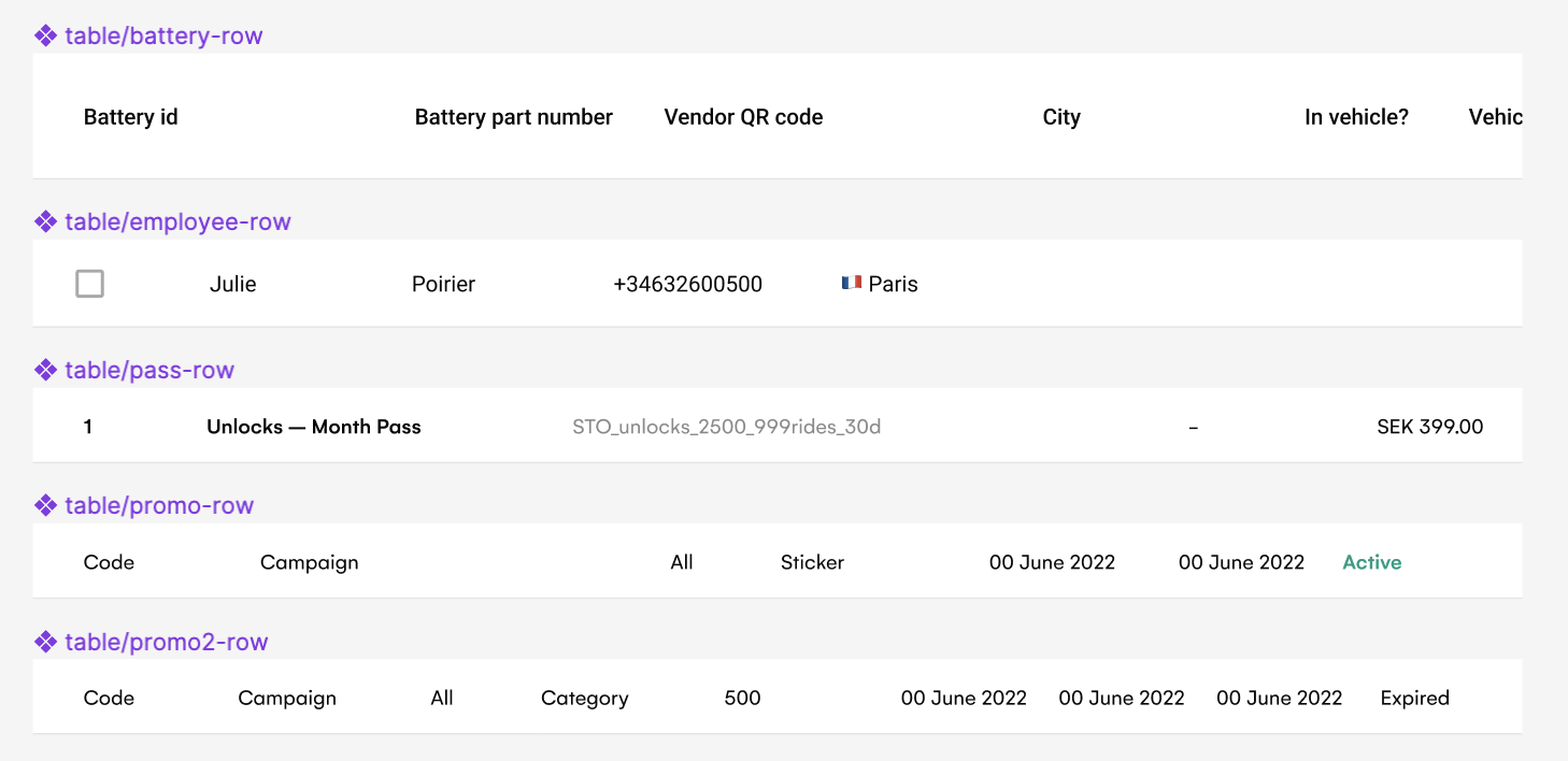
Such aproach didn't take the data type into account and hence wasn't very flexible. I decided to make the cell type the key component. I introduced various cell types based on content and added some neat details, such as tabular numbers for easier comparison in a column
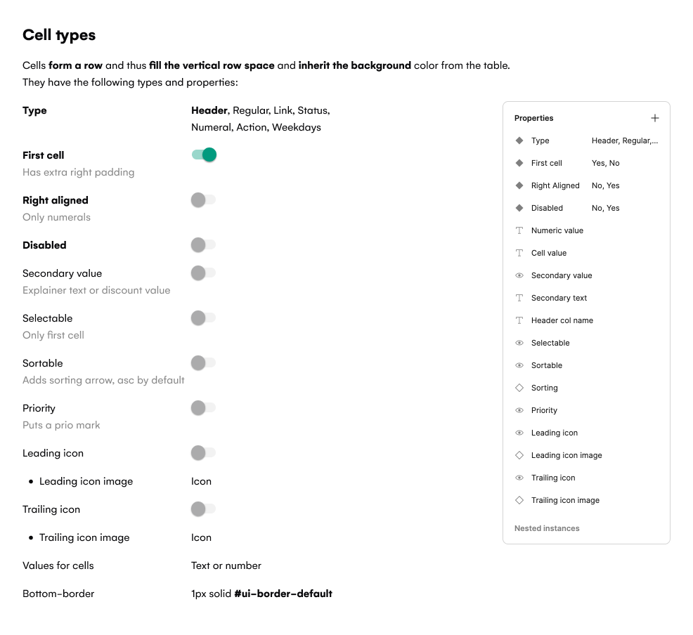
.png)
Here's a part of the spec that describes types of cells.
Here are some examples of before and after.

Batteries table – before
Batteries table – after
Active passes – before
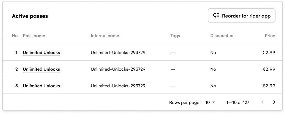
Active passes – after
Rider Design system proposal
I made a proposal for further development of design system for the Rider app. The state of things was problematic.
Changes to the UI couldn't be made in one place, every new screen had to be built from scratch, there was no dedicated people for the design system.
Proposal step by step
- Audit of the current components and patterns of the Design library with the design team
- Prioritized list components to rework
- Got a buy-in from the designers
- Made a detailed plan of what needs to be done: from goals and value of DS to processes to vision for the next 1-2 years.
- Ran a workshop with engineers about we need in a DS and what's realistic to build. As a result:
- Made a case why we need design system
- Learned out about developer's needs and set the focus for the next quarter
- Came up with a definition of MVP design system
- Made a list of specific todo's to get going, such as:
- set up JIRA epic and stories for each component,
- do research on tooling (is there Sotrybook but for mobile?),
- formulate design and accessibility principles
- do inventory of components in the code,
- start creating tokens, etc.
- 🥳 Got a buy-in form the CTO, who was up for putting more resources for the design system.
This project was discontinued due to changes in team and priorities.
UI Component library changes
- As a part of design system rework I've restructured the design library:
- reduced the number of categories for easier search
- ordered categories alphabetically
- made icons into components
- introduced a master component for the complex components with lots of variants
- Broke down color names into Light and Dark categories and renamed them semantically
- Problem
One palette for Light and Dark modes, which included neutrals and 4 brand colors. Neutrals named as shades of grey (lightest grey, lighter grey, light grey – what does that even mean?). No clarity when each shade is used. - Outcome
Used color tokens and did the matching for Light and Dark themes, one set of neutrals from Neutral-100 to Neutral-900, added semantic names for the themes, so that for example “Lightest grey” became "Element”, "Lighter grey” became "Border”. - Introduced the color change to the dark mode palette
- Problem
Brand colors were too bright on the dark background - Outcome
New dark mode colors are more muted, contrasting, and thus accessible - Added banner component for messaging in the app: information, error, warning.
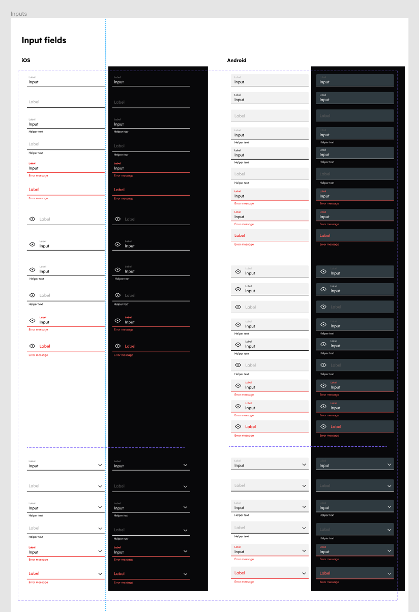
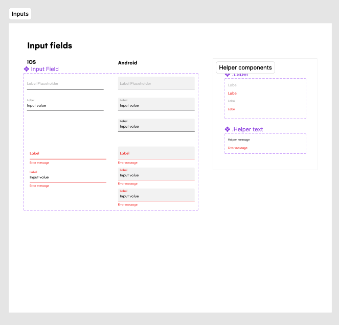
- Rebuilt components with autolayout and Figma properties to make them more optimized, robust and responsive. Input field for the Rider app example below.
Input components – before. Lots of variants for both iOS and Android.
Input components – after. Simplified after component optimization.
Rider UX
Rider UX work can be shown on request
Operations
Operations / Internal tooling work can be shown on request
Discovery
Discovery work can be shown on request